
photo / yansuKIM
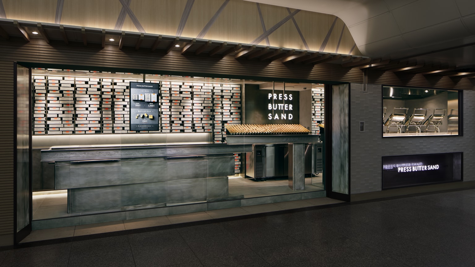
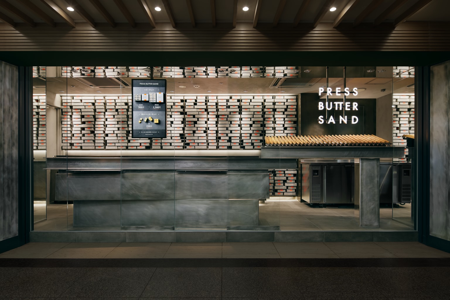
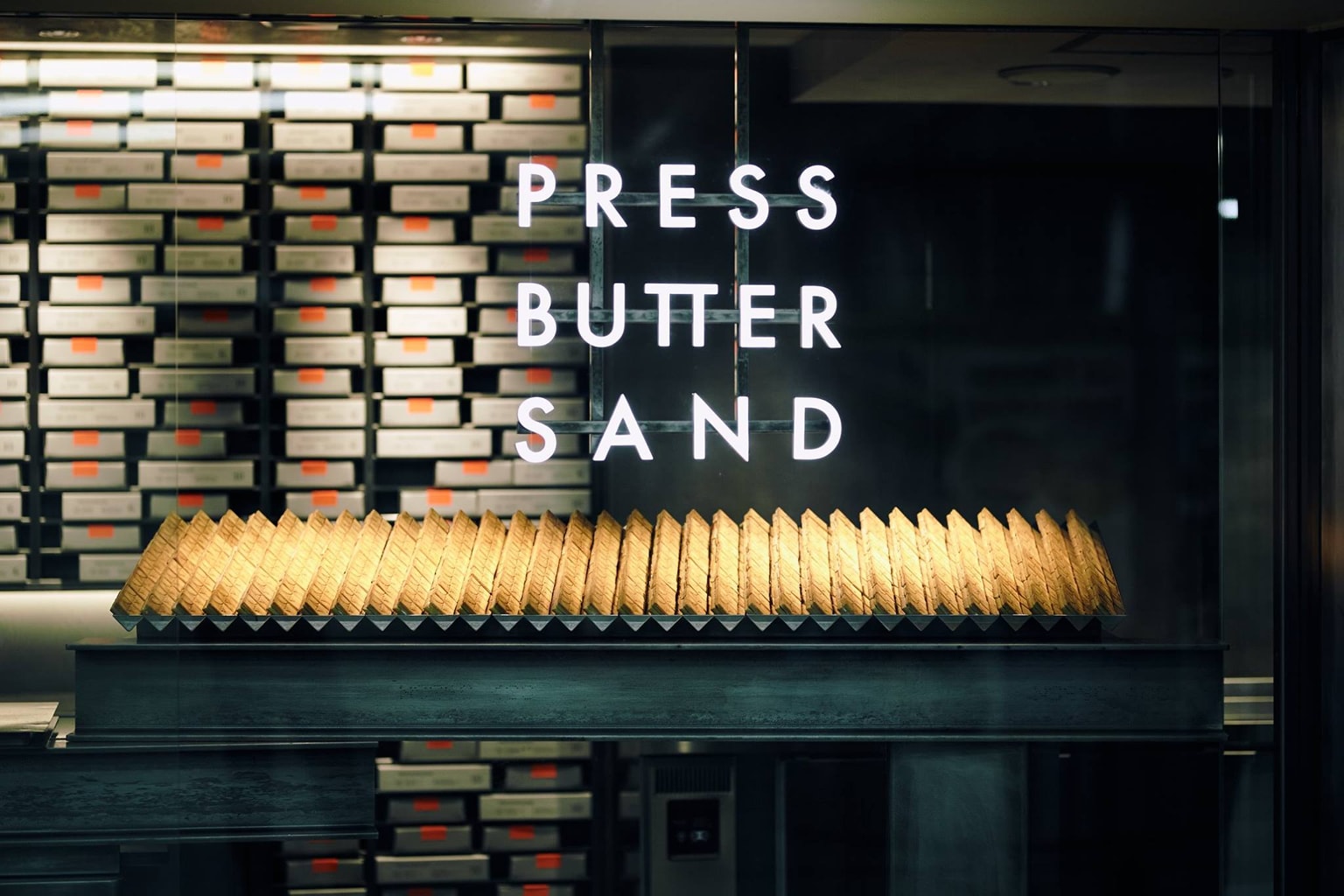
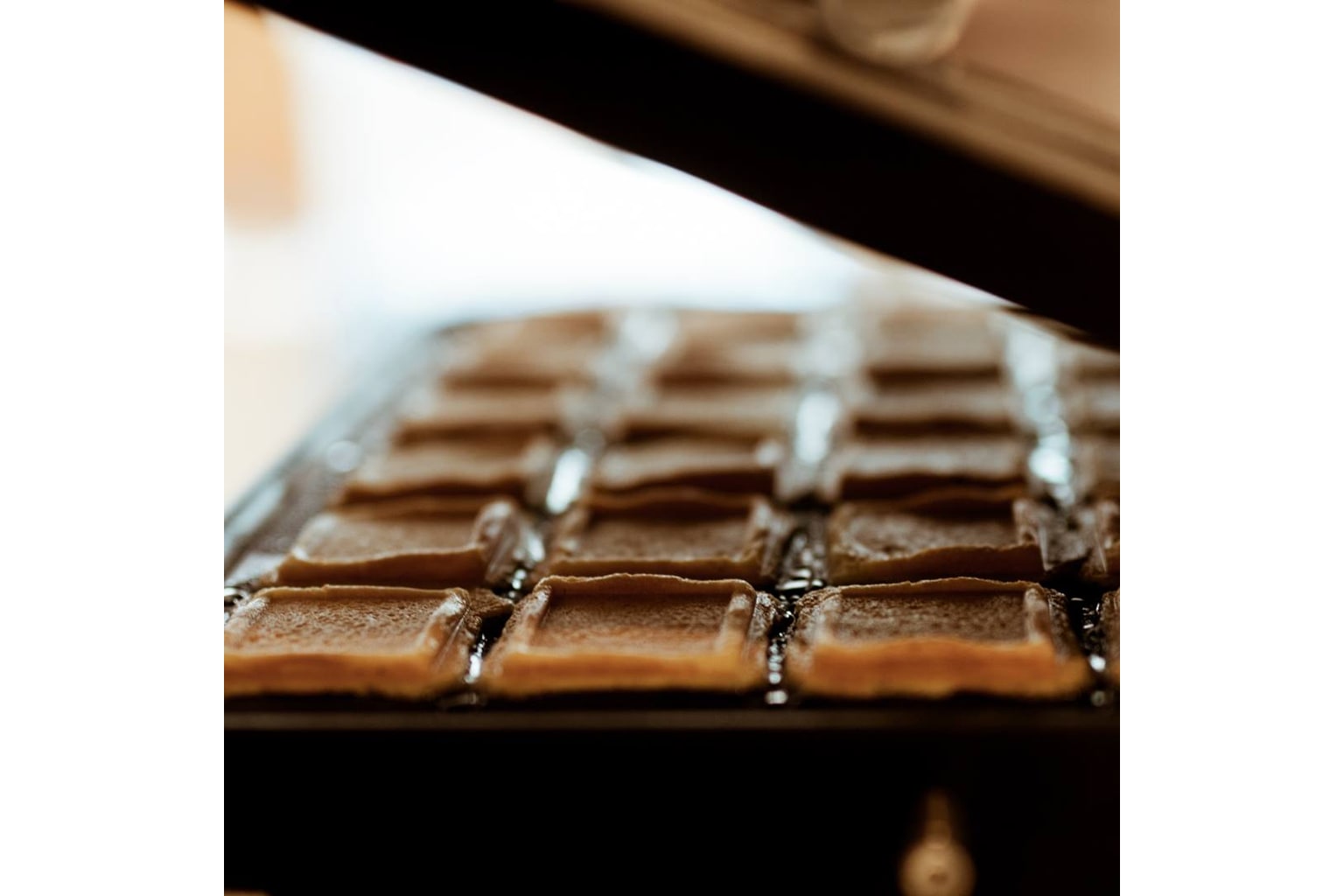
“Press Butter Sand” is a new type of confectionery made with selected ingredients by a unique method called hasami-yaki. Confectionaries made by sandwiching them between iron plates can only be made in small quantities. I was fortunate to be involved from the branding stage of the products to the design of the first shop. The location is along the bustling walkway in Tokyo Station, and its floor area is only about the area of a kiosk. Therefore, the time for customers to interact with the shop is very limited. It is essential to promote the brand as much as possible in a very short amount of time, and for this we decided to narrow down the information to a single theme.
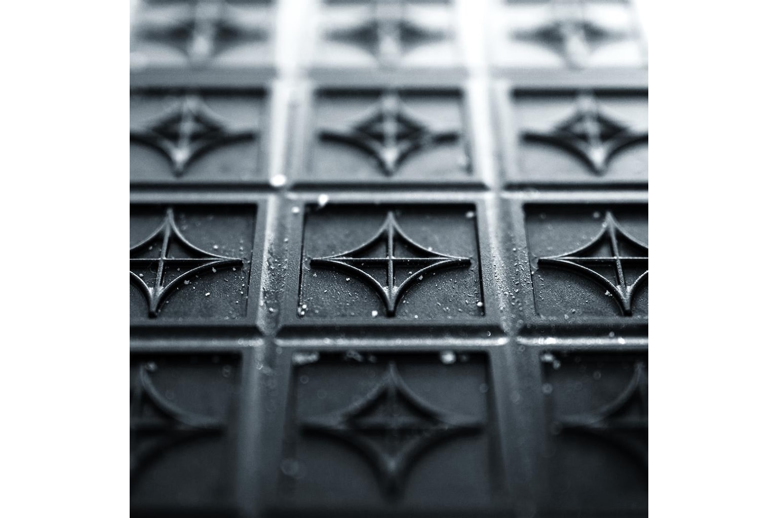
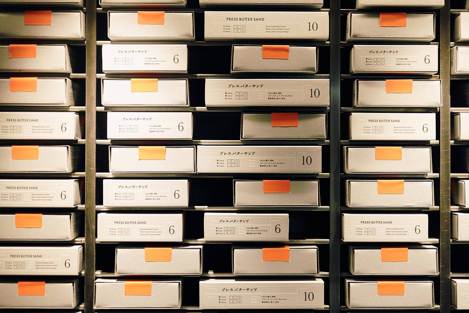
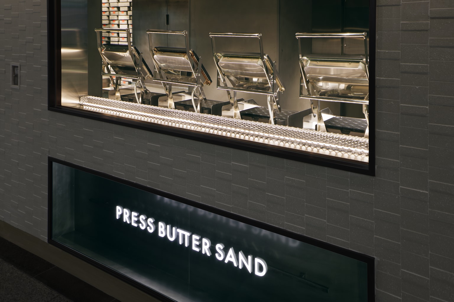
The casting iron used for hasami-yaki is honed and polished every time it is used, and the original appearance of the material starts to emerge. The space was composed with this raw iron material, to capture the true essence of things in the space. This mindset overlaps with the “Press Butter Sand” pursuing the true essence of confectionary making in developing baking methods and selecting the best materials. The wall was designed to showcase a craftsman-like product making with boxes placed carefully one by one into the polished iron shelves. The package design is by the art director Yumiko Kakizaki. The fluorescent-colored label resembles iron melting in high temperature and shares the same theme of “iron” with the space.
The sound of trains running overhead is heard in the shop. The rails are also polished only where it rubs against the wheels, exposing the raw steel. The design conveys the background of the location, Tokyo Station (Japan’s most famous terminal station).
『プレスバターサンド』は「ハサミ焼き」という独自製法とこだわりの素材で作られる新しい焼き菓子だ。鉄鋳物で挟み焼く工程のお菓子は小ロットでしか作れないという。そのブランド開発の段階から、1号店へ向けて関わらせて頂いた。場所は人通りの多い東京駅内の通路上。わずかKIOSK程度の面積。よってお客様が空間に接する時間はほんのわずか。短時間で最大限ブランドを伝えることが重要だった。そのためテーマを1つに絞ることにした。
「ハサミ焼き」の鋳物の鉄。鉄は使われる度に研がれ、磨かれ、素材本来の姿が現れる。この「鉄の地肌そのもの」で空間を構成したいと考えた。ものの本質を空間に創出すること。それは『プレスバターサンド』が製法や素材を追求し、焼き菓子の本質を目指す姿とも重ねている。壁面には職人的な商品作りを現すべく、磨いた鉄の棚に一点ずつ丁寧に商品箱を納めた。パッケージデザインはアートディレクター柿崎弓子氏によるもの。包装の蛍光色ラベルは高温に熱せられた「鉄」が溶ける様子を表し、空間と同じ「鉄」をテーマとしている。
店の頭上では列車がガタゴトと走りだす。そのレイルもまた車輪が擦り当たる部分だけが磨かれ輝いている。「鉄の地肌そのもの」。それは東京駅(日本で最も有名な始発駅)という場所の背景を伝えるデザインでもある。
Project / PRESS BUTTER SAND Tokyo Station Store
Open / April, 2017
Floor space / 29.10 sqm
Location / Chiyoda-ku,Tokyo,Japan
Client / BAKE Inc.
Direction / Seiji Sadakiyo (BAKE Inc.)
Interior design / Fumitaka Suzuki (Yagyug Douguten)
Lighting design / Natsumi Fujii (ModuleX Inc.)
Construction(interior) / JR East Retail Net Co.,Ltd.
Construction(fixtures) / Tanseisya Co.,Ltd.
Kitchen equipment / Mana international.inc
Shop photo / Atsushi Ishida
Merchandise photo / yansuKIM
Photo copy right / BAKE Inc.