
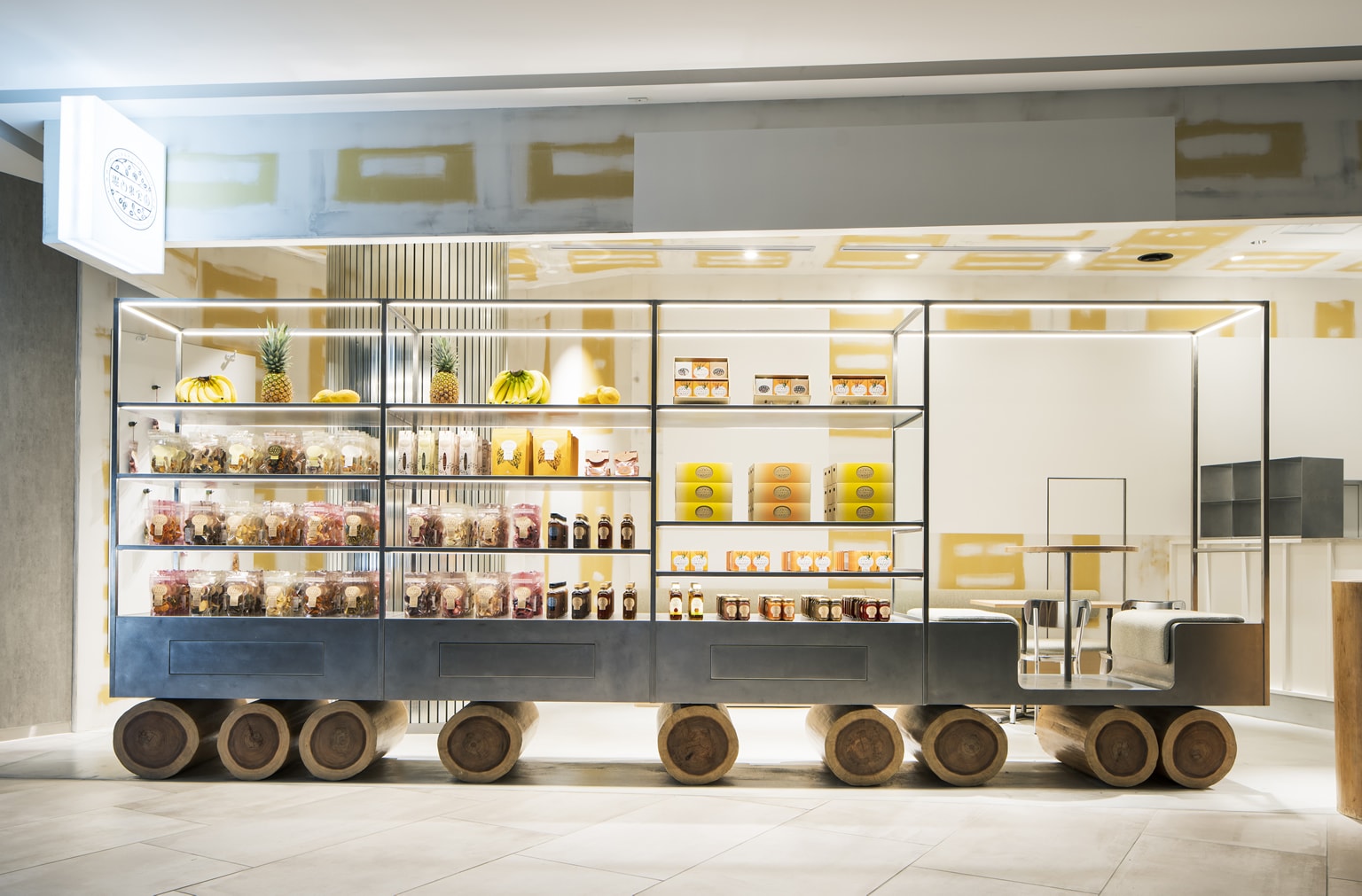

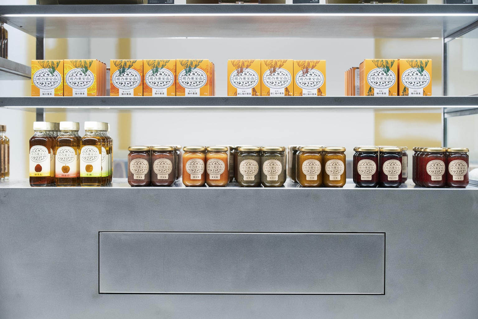
A second shop was planned after the one in Nara, the home of “HORIUCHI FRUIT FARM,” in Grand Front Osaka, a commercial facility in the redevelopment area of Osaka Station North. Here, we wanted to express in the space the fact that the products are delivered from the farm to the city and the uniqueness of the domestically made dried fruits products.
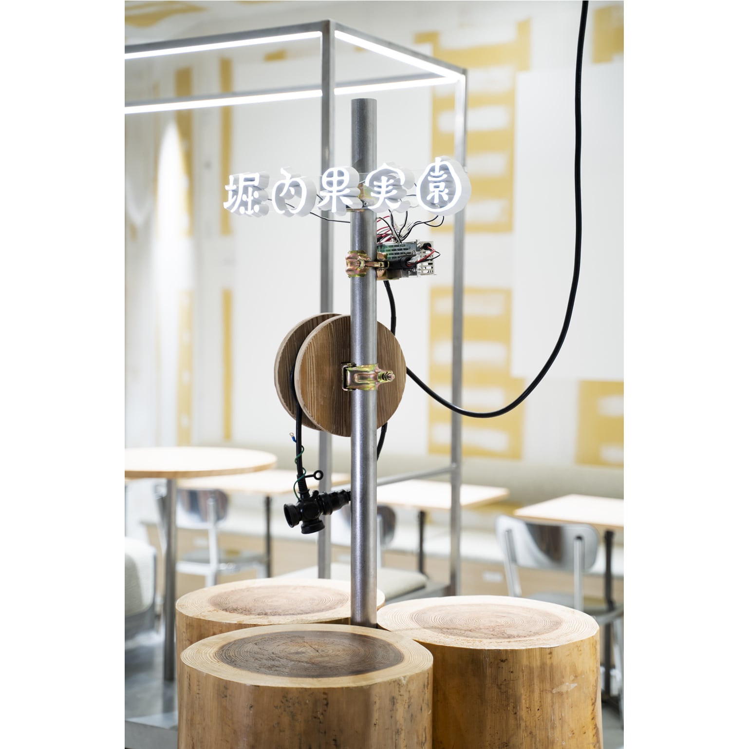
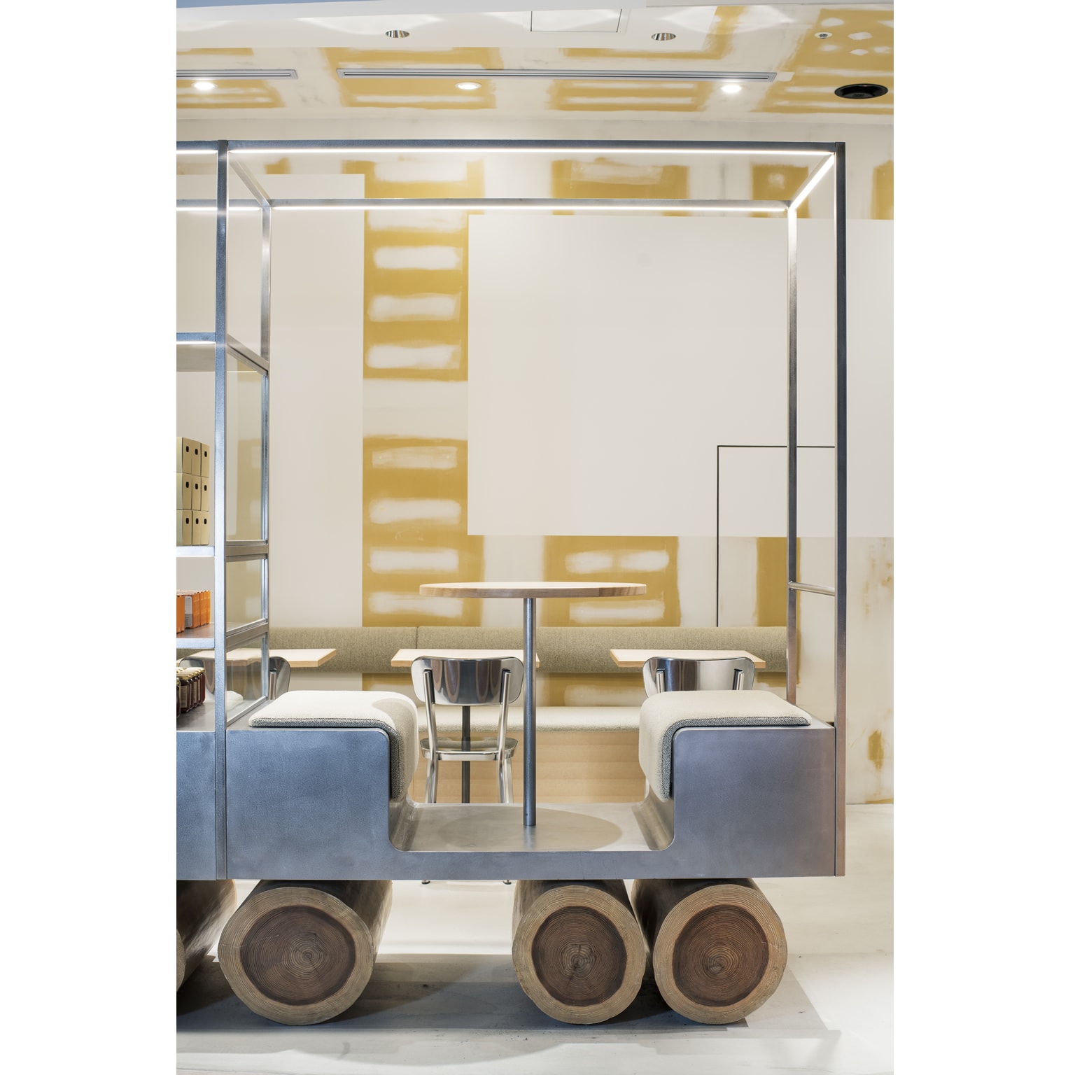
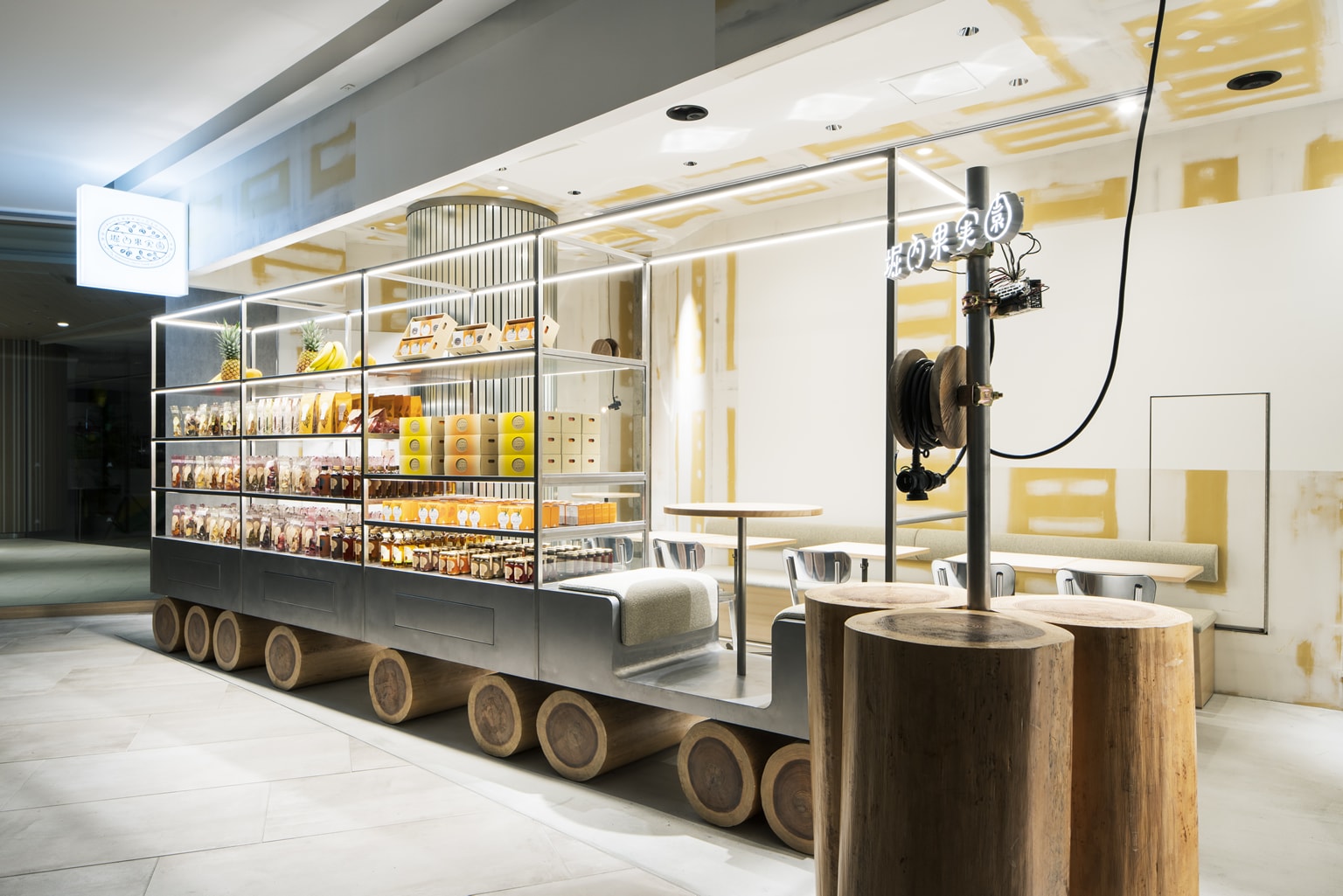
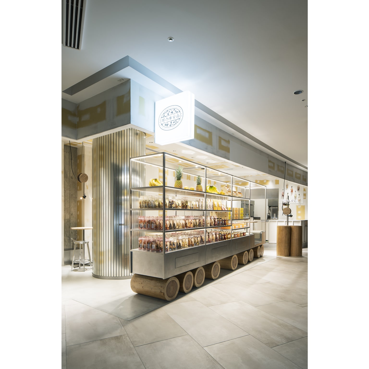
It is said that when the Pyramid was being built, the large stones were placed onto the logs and were rolled across. The logs are the primitive form of the wheels, and by adopting them, we would like to use it as a starting point to convey the meaning of “carrying” and the place where the products come from. The wheels made from Yoshino cedar trees from Nara are symbols connecting the farm and the shop. Moreover, it is also an expression of tracing the memory of the land where the former freight station used to be before the redevelopment.
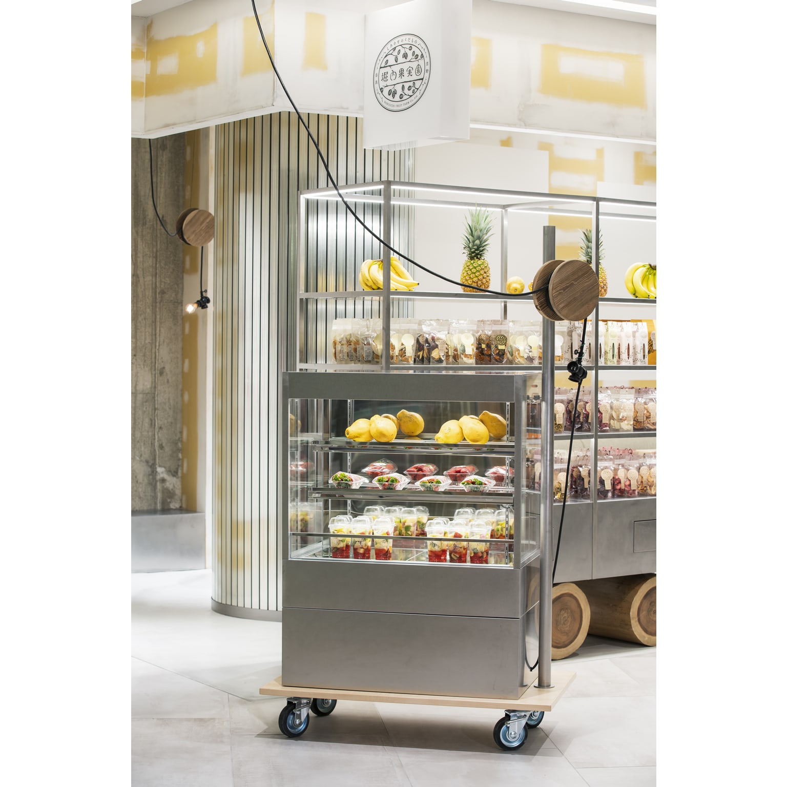
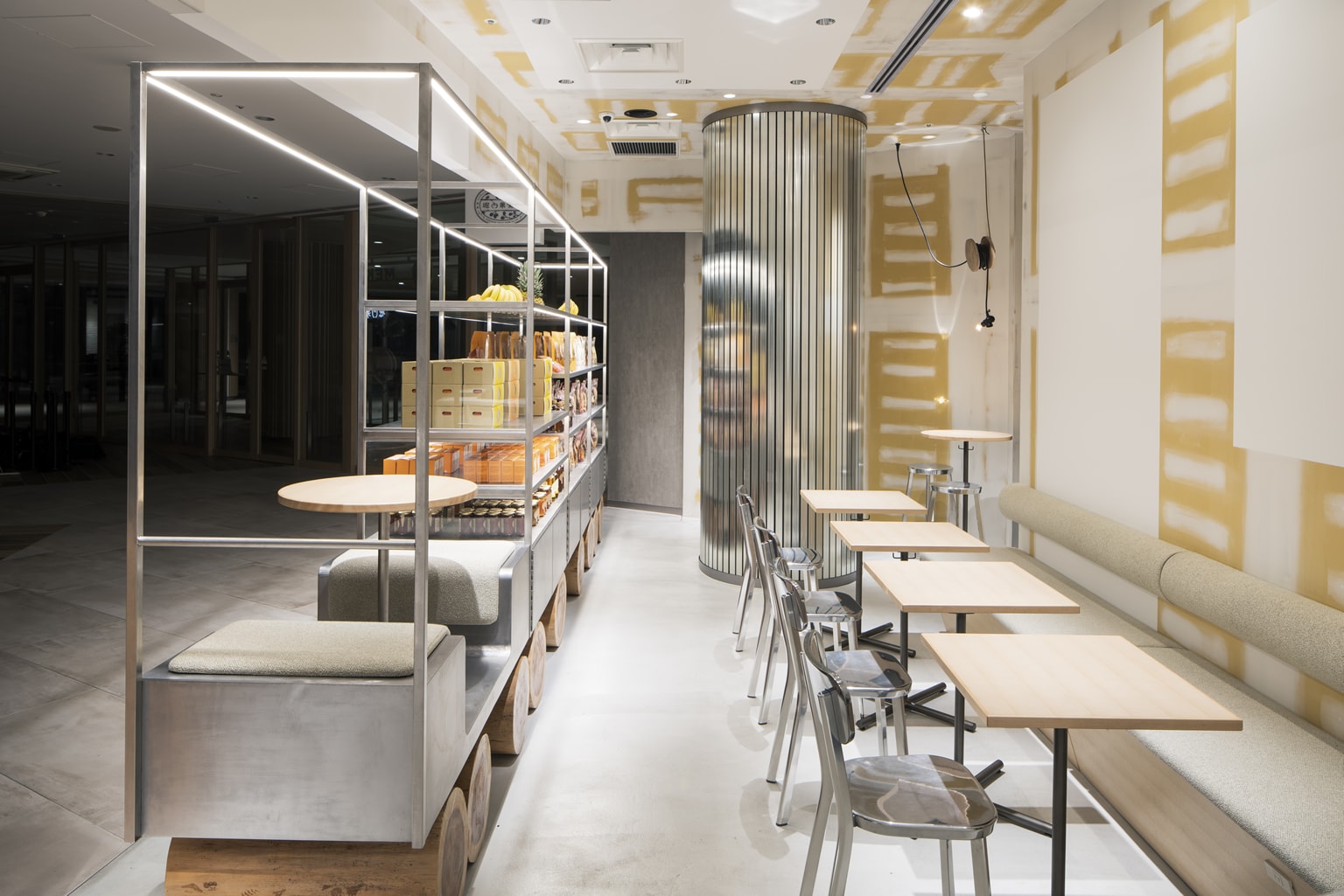
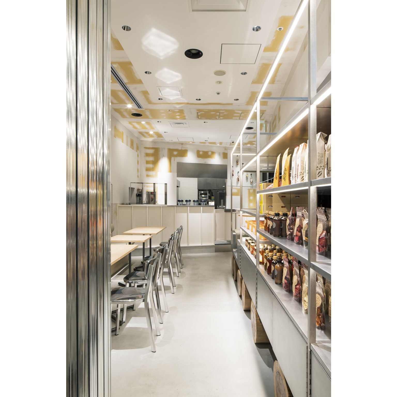
We would like to convey the inside of the fruits (fresh, simple, unobscured, honest taste). The interior is designed so that the inside that cannot normally be seen is exposed by applying transparent coating on putty base and steel base.
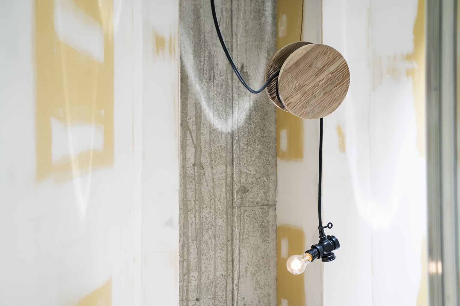
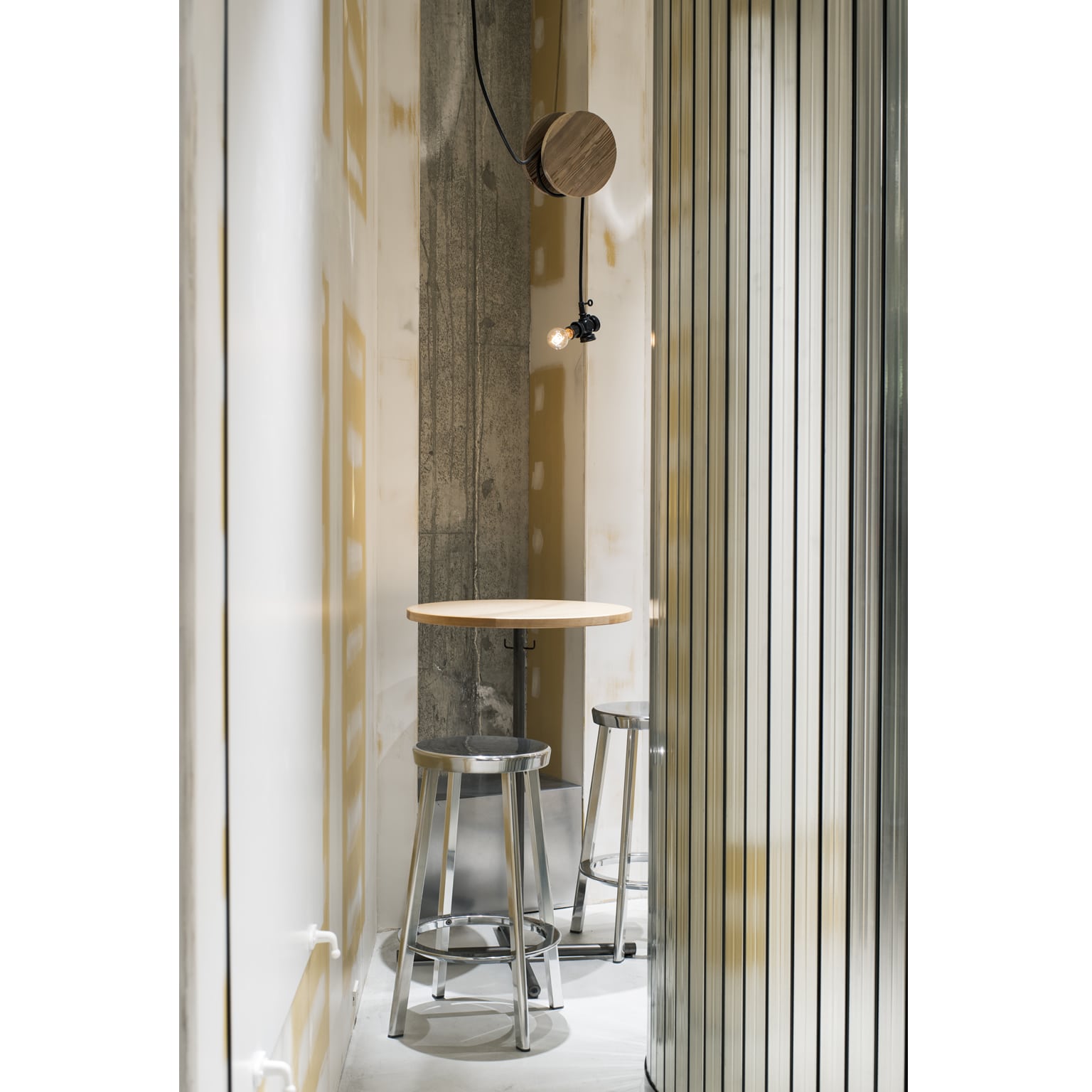
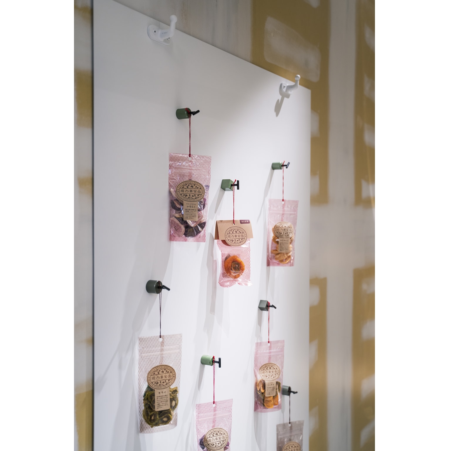
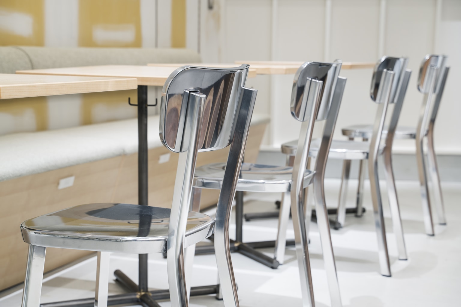
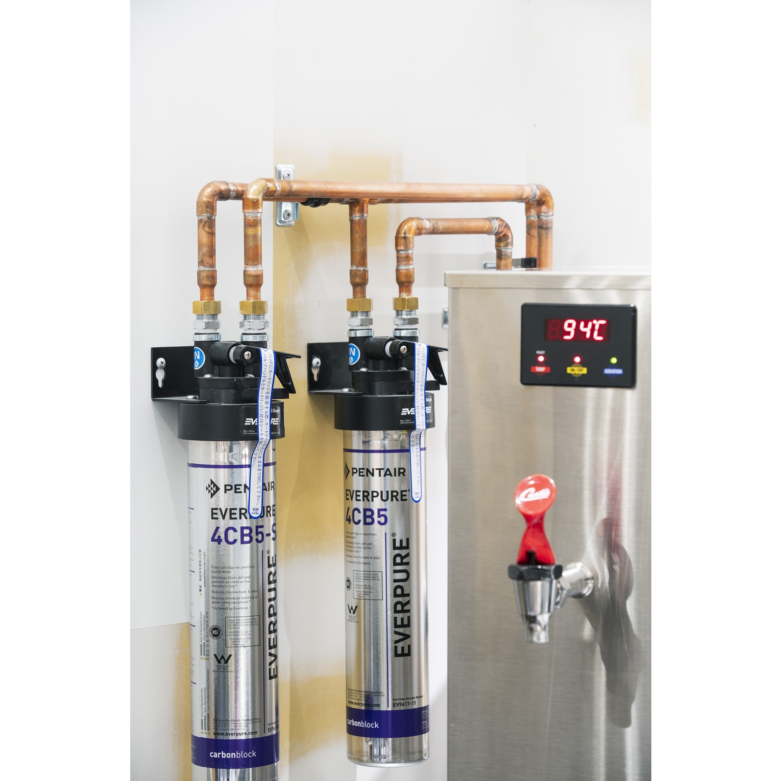
In addition, details inspired from greengrocer's distribution sites of seating tables, moving refrigeration cases, movable electric power source and magnetic hooks were adopted.
People and goods will come and go here, and we hope that bustling scenes like the ones from a freight station and stories come alive here again.
大阪駅北の再開発エリアの商業施設、グランフロント大阪に、『堀内果実園』の地元・奈良に続く二号店が計画された。ここでは「農園から都会へ届ける」という事、「国産のドライフルーツ」と言った商品の独自性を空間に表現したいと考えた。
古代ピラミッド建造の際は大石を丸太に乗せて転がしたと言われている。丸太は車輪の原始的な形である。それを用いることで「運ぶ」という意味や産地への想いを巡らせる基点としたい。奈良、吉野杉の原木の車輪は農園と店舗をつなぐ象徴だ。また、再開発前は貨物駅跡地であった土地の記憶を辿る表現でもある。
果物の内側(フレッシュで、飾らず隠さず、素直な味)を伝えたい。内装はパテ下地や鉄素地に透明コーティングをすることで「普段は見えない内側を晒す」ことを目指した。
また、乗車席テーブル・動く冷蔵ケース・可動電源・磁石フックなど青果の物流現場から発想したディティールを取り入れている。
ここに人や産物が行き交い、再び貨物駅のような賑やかな風景と物語が生まれればと思う。
Project / HORIUCHI FRUIT FARM Grand front Osaka Store
Open / March 14th, 2019
Floor space / 50.25 sqm
Location / Osaka-shi,Osaka,Japan
Client / HORIUCHI FRUIT FARM
Interior design / Fumitaka Suzuki (Yagyug Douguten)
Lighting design / Natsumi Fujii (ModuleX Inc.)
Construction / Hankyu Kensou Co.,ltd
Kitchen equipment / Aria co.ltd.
Shop graphic design / Ryoko Nagaoka
Flyer illustration / Kaoru Machida
Corporate identity design / Tomohiro Kato (Eding:Post)
Photo / Kiyoshi Nishioka
Photo copy right / Kiyoshi Nishioka