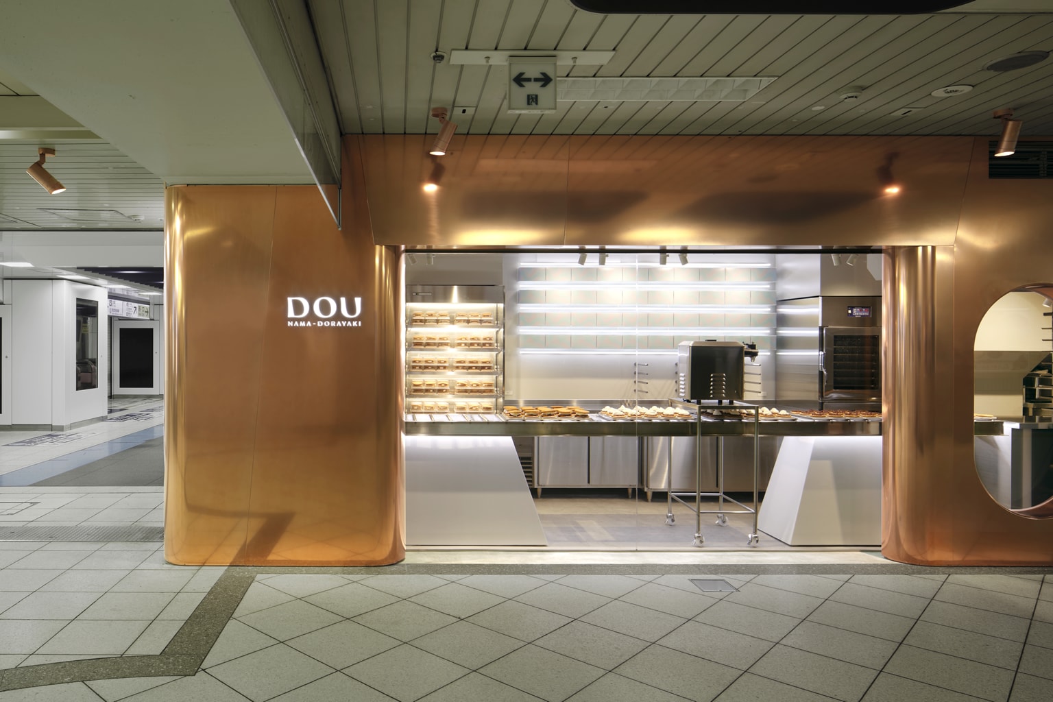
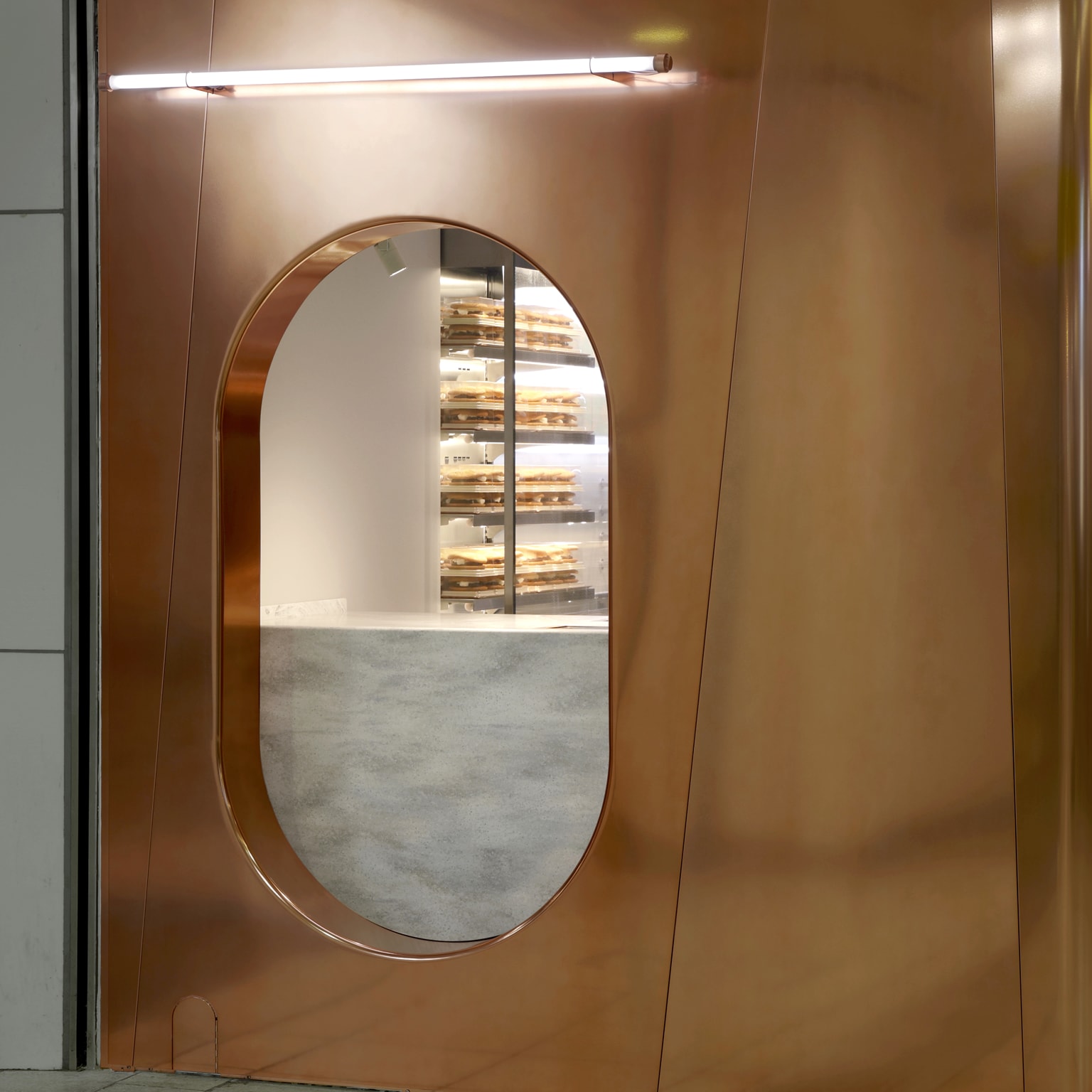
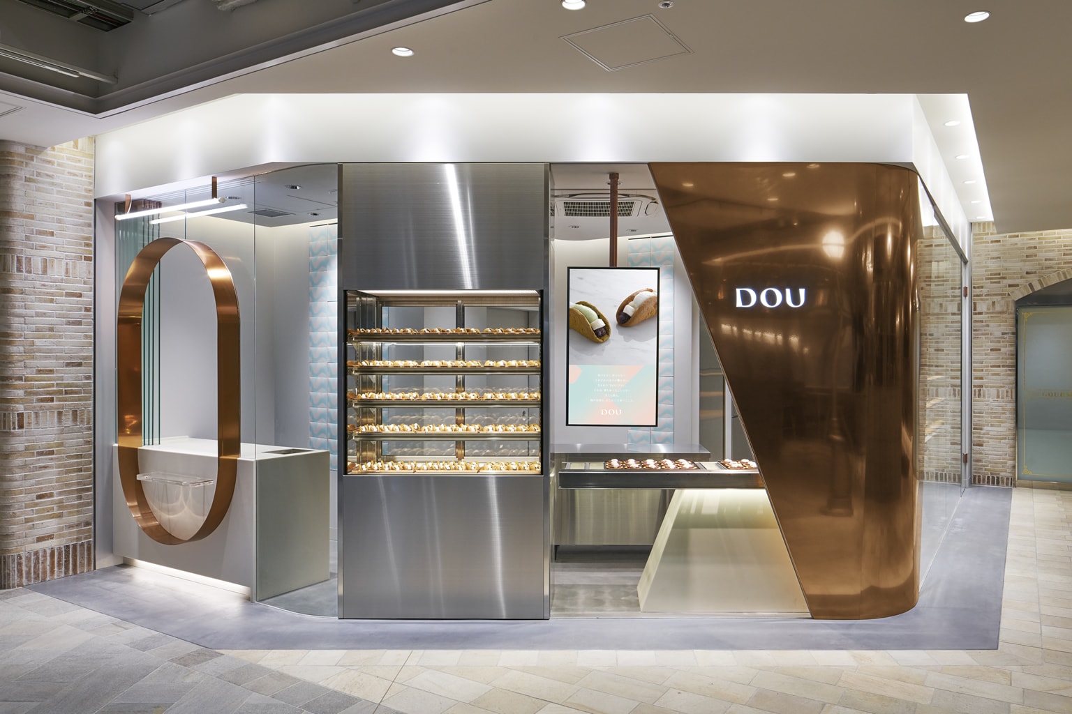
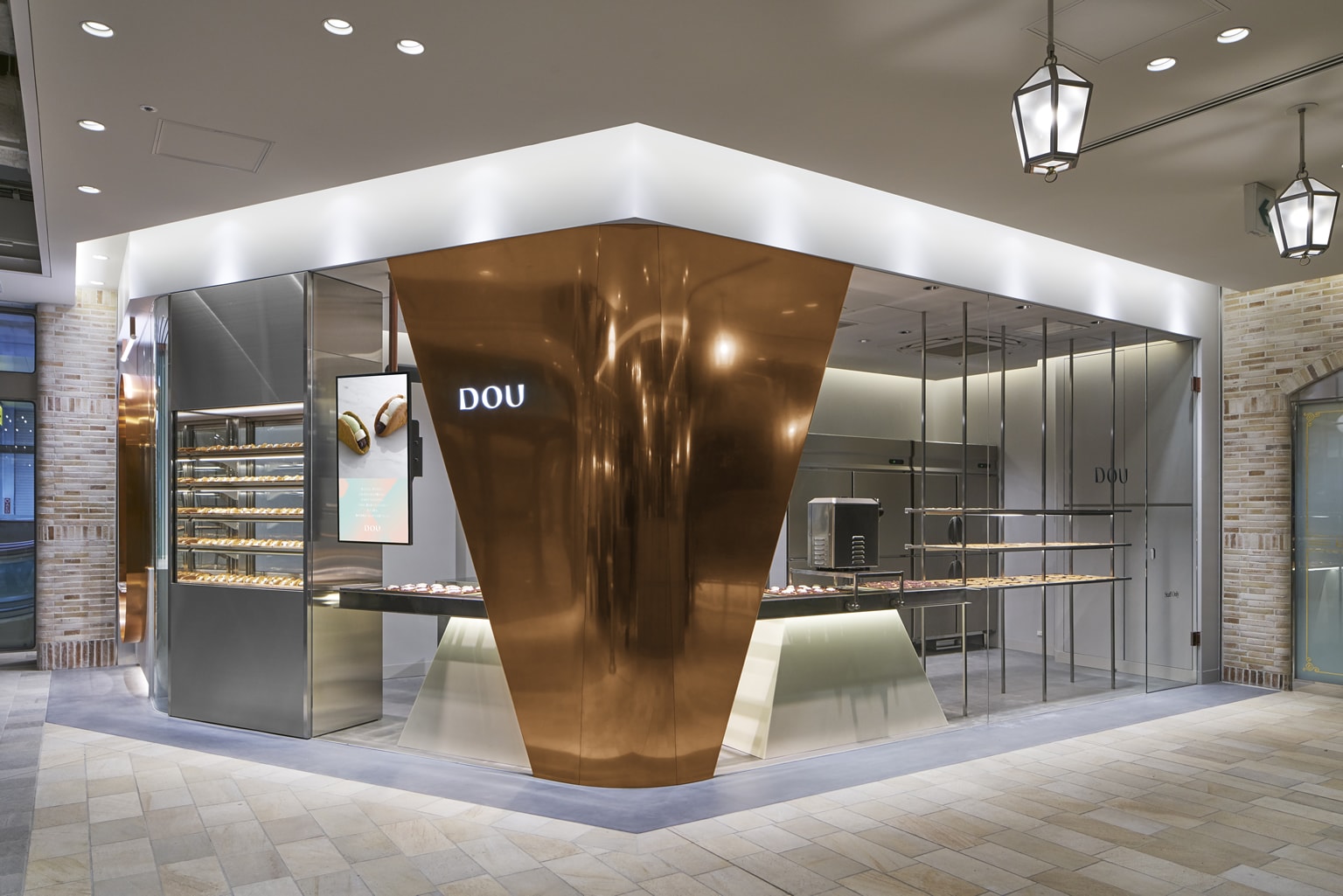
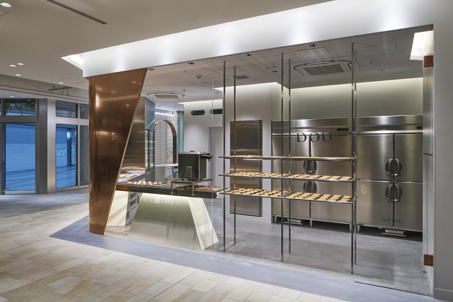
“Dou” is a brand striving to evolve the common Japanese sweets, dorayaki, and was established in 2016 as a raw dorayaki specialty shop. The name originates from the Japanese word for road “道”(pronounced “dō”) and the English word “dough.” The word “dō” expresses the spirit of refinements in arts such as the tea ceremony and other traditional arts. This name expresses the client’s attitude towards their new challenge in Japanese sweets in their continuous pursuit in essential and innovative confectionary production. For interior finishes, copper—also pronounced “dō” in Japanese—is used, which is also the source of the word “dorayaki.”
The package design by art director Hironao Kawanishi has gradation colors which is inspired by the green-blue patina on copper. A new type of dorayaki made by the company specializing in western confectioneries was the idea behind creating an interior with Japanese and Western style resonating with each other.
『ドウ』は和菓子の代表的な「どら焼き」を追求したブランド。2016年に生どら焼き専門店として生まれた。名の由来は日本語の「道」や英語で小麦生地を意味する「dough」。「道」は茶道や芸道における心を表す。お菓子の本質を追求し進化しつづけるクライアントが初めて挑む、和への姿勢の表れである。内装には同じ発音で「銅鑼焼き」の語源でもある「銅」を用いている。
アートディレクター河西宏尚氏によるパッケージデザインも銅が緑青を帯びる姿から発想されたグラデーションカラーだ。洋菓子の得意な会社の作る新しいどら焼き。和洋が共鳴していく姿をインテリアにも表したいと考えた。
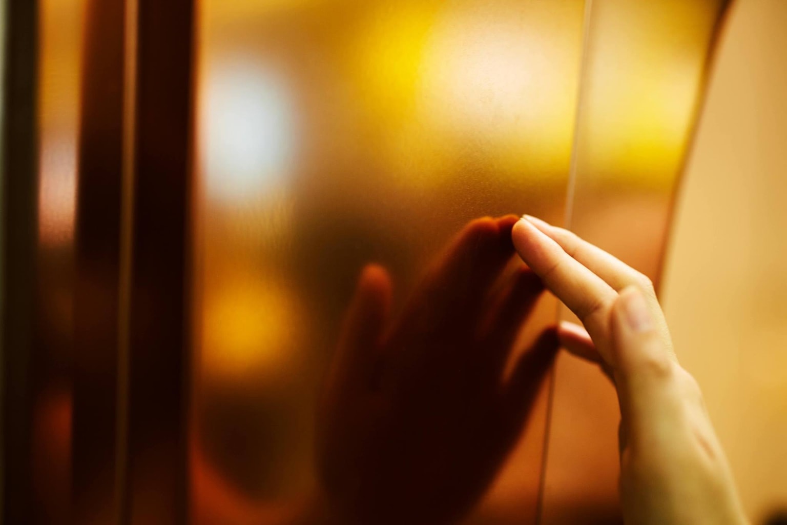
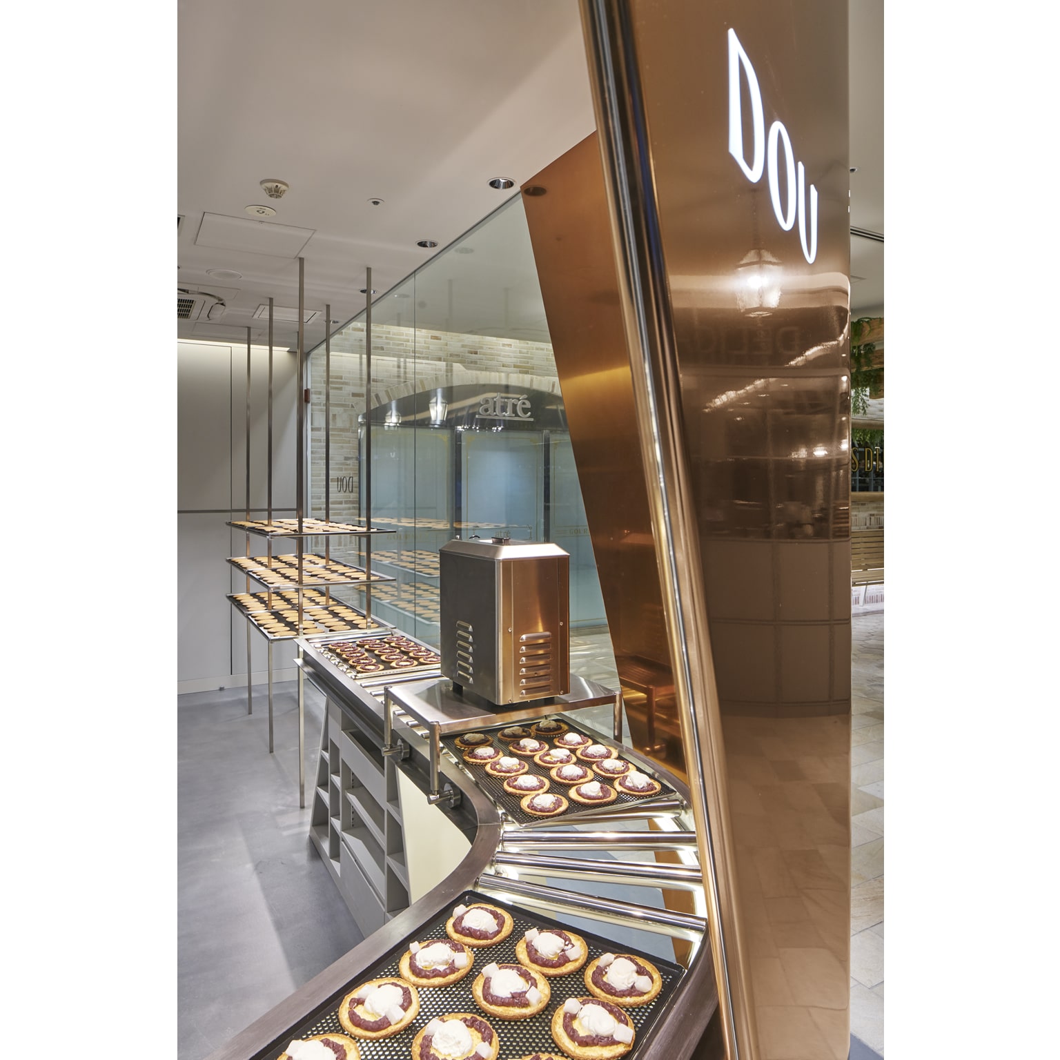
The bustling scenery of the train station is dimly reflected onto the copper-colored capsule. At the other side of the window, the dorayakis roll across the rollers, and the world of dorayaki pops up in our daily life. The aim was to create a point of contact leading to another world like the “Anywhere Door” (a tool from the long-lived Japanese anime Doraemon).
池袋店
駅の雑踏風景が銅色カプセルにぼんやりと映り込む。窓の向こうにはコロコロとどら焼きがローラーの上を動く。日常にぽっかりと現れたどら焼きの世界。「どこでもドア」のように異世界に続く接点を作りたいと考えた。
Project / DOU Ikebukuro store
Open / May, 2017
Floor space / 25.6 sqm
Location / Toshima-ku,Tokyo,Japan
Client / BAKE Inc.
Direction / Seiji Sadakiyo (BAKE Inc.)
Interior design / Fumitaka Suzuki (Yagyug Douguten)
Lighting design / Natsumi Fujii (ModuleX Inc.)
Construction / Daichi Saito (Aim Create co., ltd.)
Kitchen equipment / Mana international.inc
Shop photo / Atsushi Ishida
Merchandise photo / yansuKIM
Photo copy right / BAKE Inc.
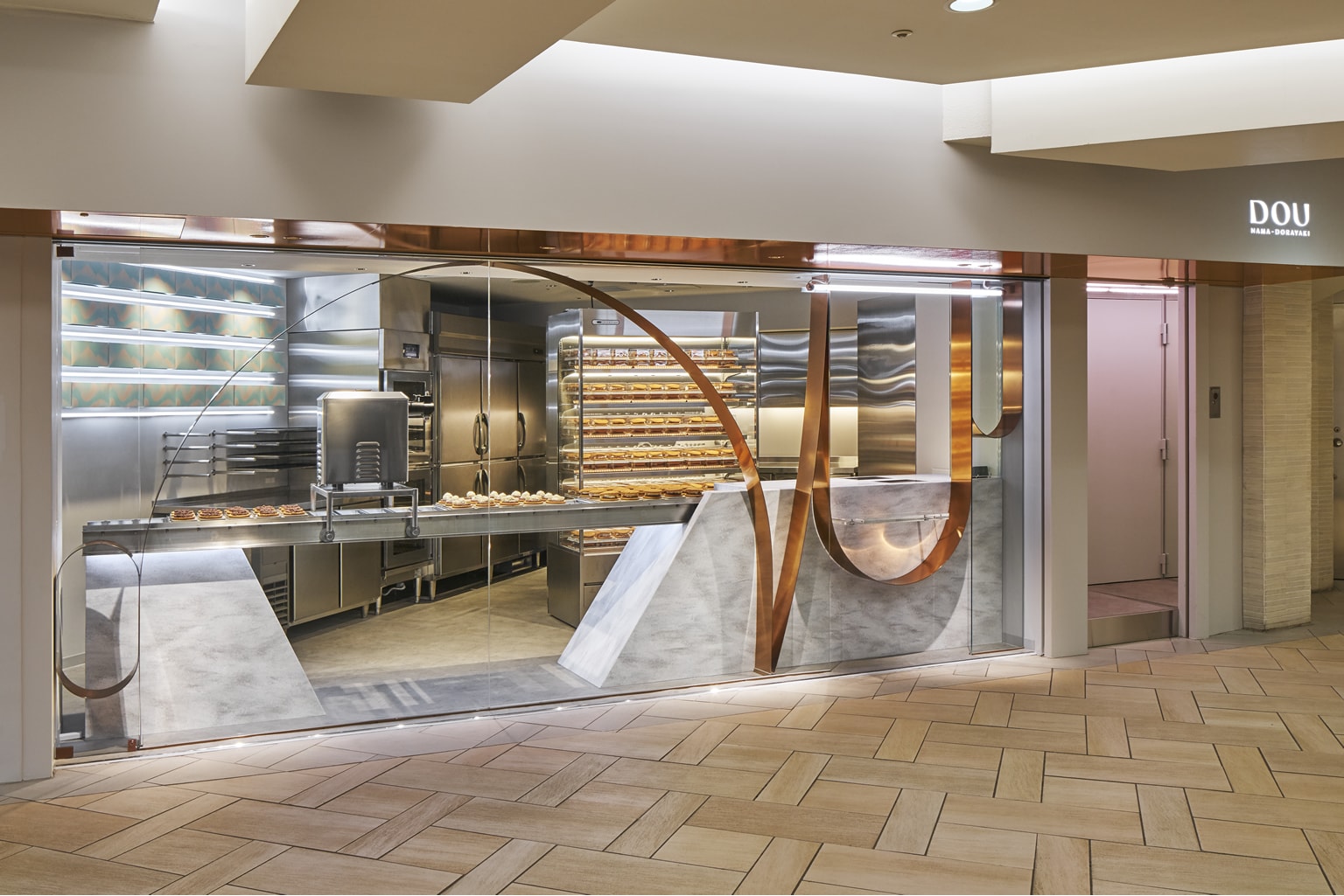
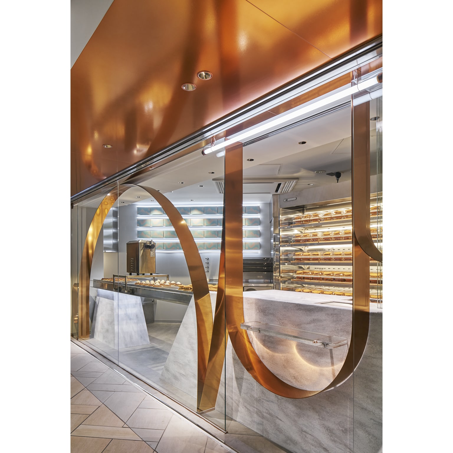
The façade was conceived from the image of traditional Japanese strings and sashes swaying in the air. Although the image is based on a Japanese motif, it is also like a light ribbon or cursive writing, expressing a Japanese-Western resonance.
新宿店
ファザードは日本の伝統的な紐や帯が舞う情景から発想された。日本的なモチーフを元にしつつも、軽やかなリボンや英字の筆記体のようでもあり「和と洋の共鳴」を表している。
Project / DOU Shinjuku store
Open / September, 2017
Floor space / 26.01 sqm
Location / Shinjuku-ku,Tokyo,Japan
Client / BAKE Inc.
Direction / Seiji Sadakiyo(BAKE Inc. ) Ryotaro Katsube (BAKE Inc.)
Interior design / Fumitaka Suzuki (Yagyug Douguten)
Lighting design / Natsumi Fujii (ModuleX Inc.)
Construction / Daichi Saito (Aim Create co., ltd.)
Kitchen equipment / Mana international.inc
Photo / Yasuhiro Takagi
Photo copy right / BAKE Inc.
The wall which looks as if it was cut with a knife was conceived from the traditional Japanese origami standing softly and gently. The copper-colored mirror with an anti-fog metal coating reflects us in the present time, and expresses the attitude towards the timeless challenge of making dorayaki.
川崎店
刃物で切り込まれたような壁は、日本の伝統的な折り紙がフワりと立つ姿から発想された。特殊な金属塗装によって曇る事のない銅色の鏡。そこへ現在の私たちが映りこむ。時代を超えて挑戦する、どら焼きへの姿勢を表している。
Project / DOU Kawasaki store
Open / February, 2018
Floor space / 34.8 sqm
Location / Kawasaki-shi,Kanagawa,Japan
Client / BAKE Inc.
Direction / Ryotaro Katsube (BAKE Inc.) Ai Nakazato (BAKE Inc.)
Interior design / Fumitaka Suzuki (Yagyug Douguten)
Lighting design / Natsumi Fujii (ModuleX Inc.)
Construction / Daichi Saito (Aim Create co., ltd.)
Kitchen equipment / Aria co.ltd.
Shop photo / Yasuhiro Takagi
Photo copy right / BAKE Inc.