BAKE CHEESE TART Abeno Harukas Store
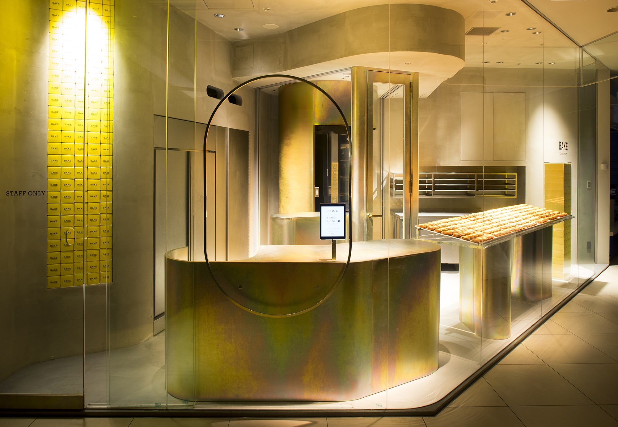
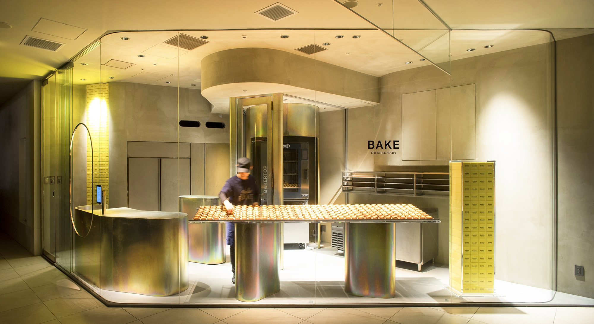
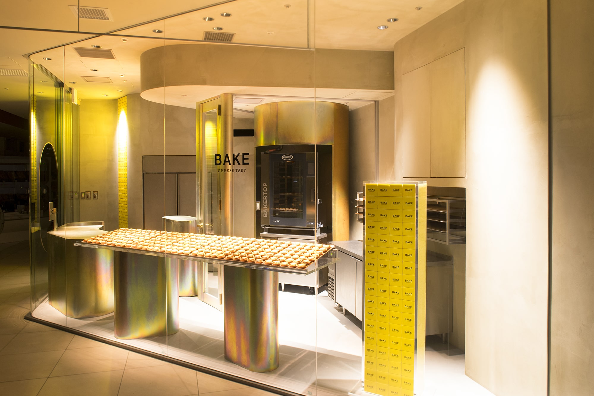

『ベイクチーズタルト』は焼きたてチーズタルトの専門店で、工房一体型をテーマとしている。工房一体型とは店内で焼きたての商品を提供することはもちろん、調理の臨場感や店舗のデザインを人々に楽しんでもらうことだ。
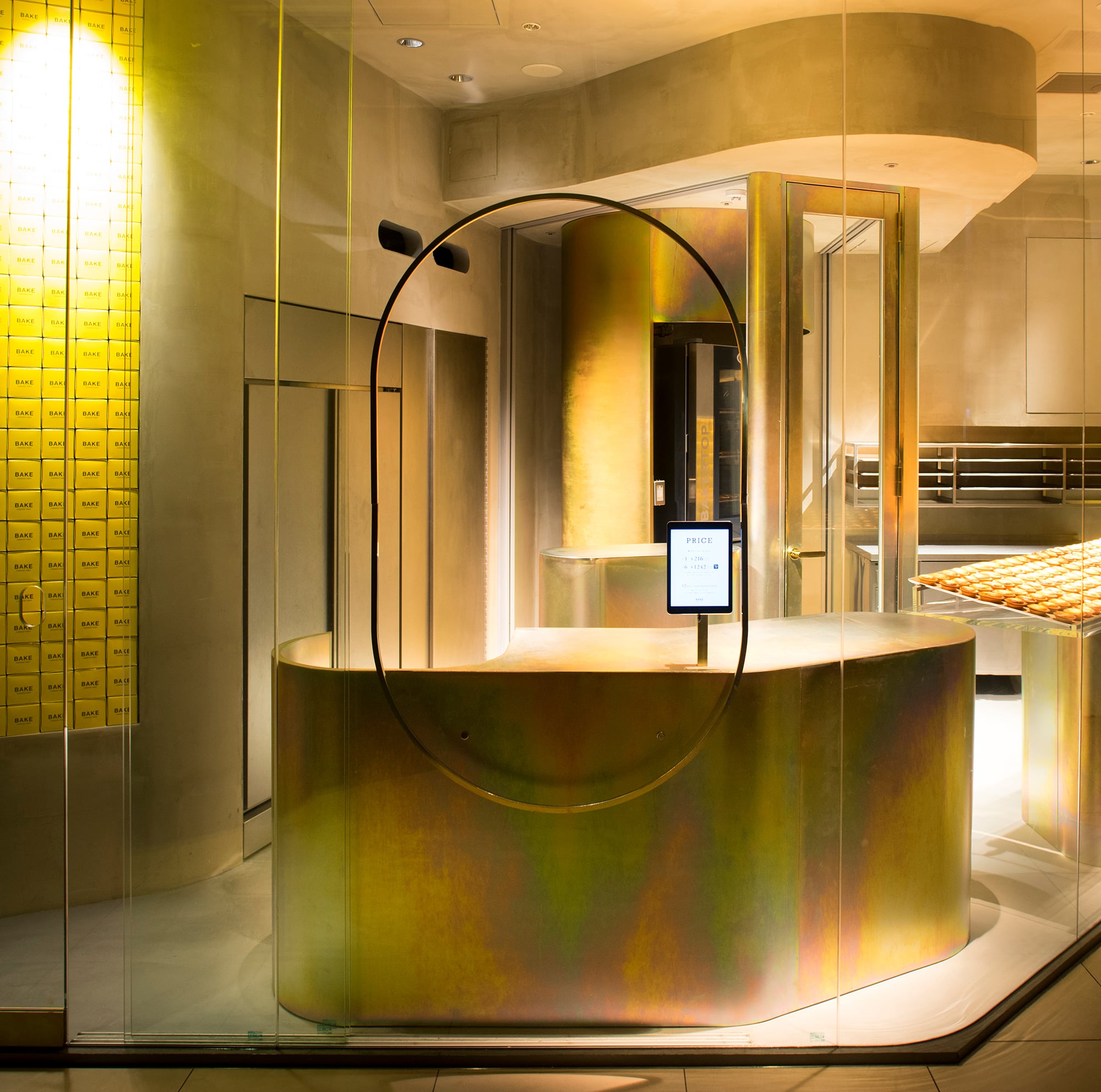
この店は百貨店の食品売場という、まるで朝の市場のような賑やかな環境であった。その環境ではさらに大きな声を出すより、寺院のような静寂さに徹することで逆に目立ち商品をアピールできるのではないかと考えた。そこで環境と店を隔てるべく全面をガラスで覆い、接客部分のみ象徴的なリングで縁取った穴を明けた。
この地域は日本の戦後経済を支えたような職人たちの下町工場がならび優れたメッキ技術が残っている。一方で歴史深い寺院も残り、仏像もメッキの輝きをまとっている。この地域ならではの相反した風景だ。
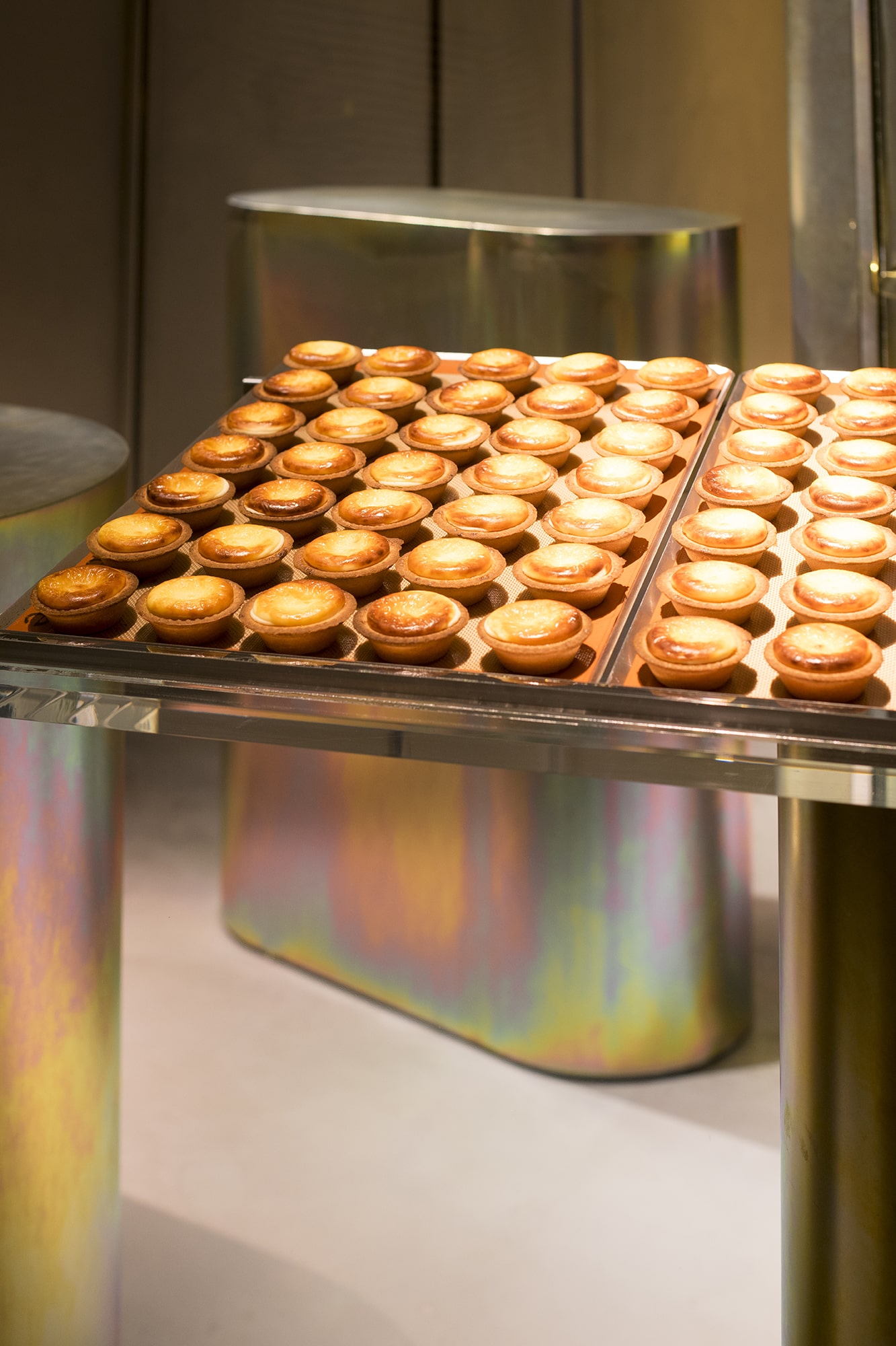
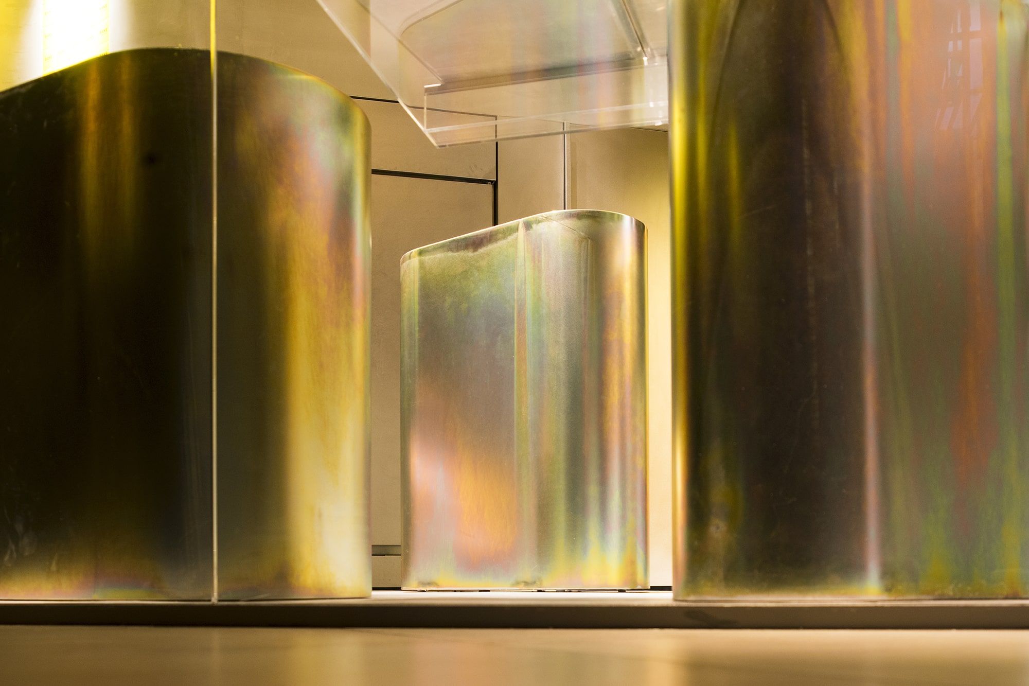
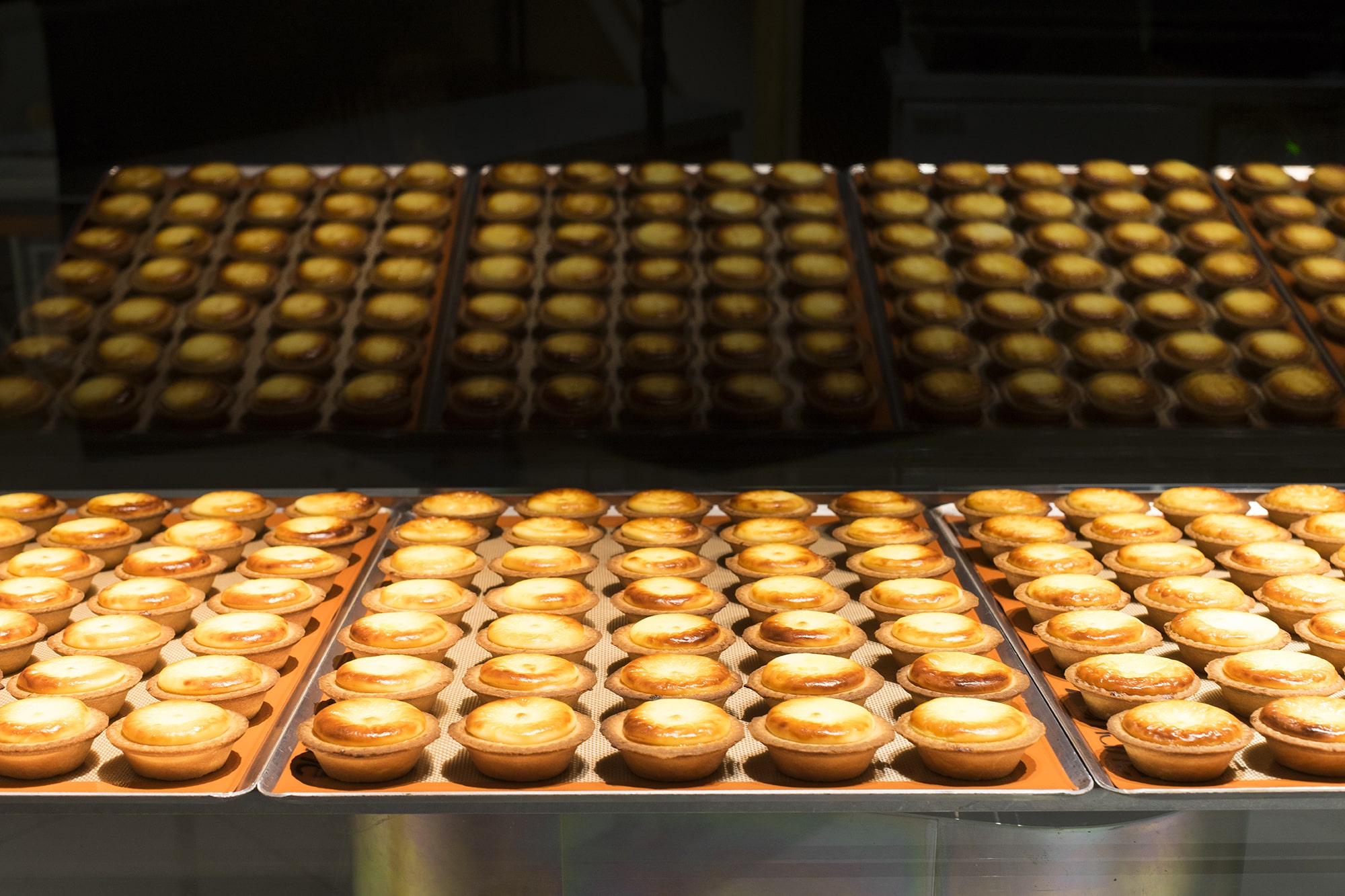
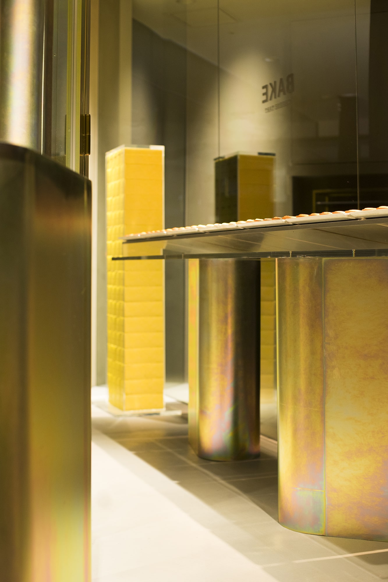
厨房はガラス越しに丸見えだ。そこに工業製品に使われるメッキを施された什器が並ぶ。黄・金・虹色が表れるメッキ。それが焼きたてのチーズタルトの熱・色・香りを表現できるのではないかと考えた。甘く柔らかいチーズタルトと硬くて工業的なメッキ。相反するが、どこかシズル感を感じる組み合わせだ。ちなみに私は不謹慎ながら仏像を見て「美味しそう」と思った事がこのアイデアの原点となった。
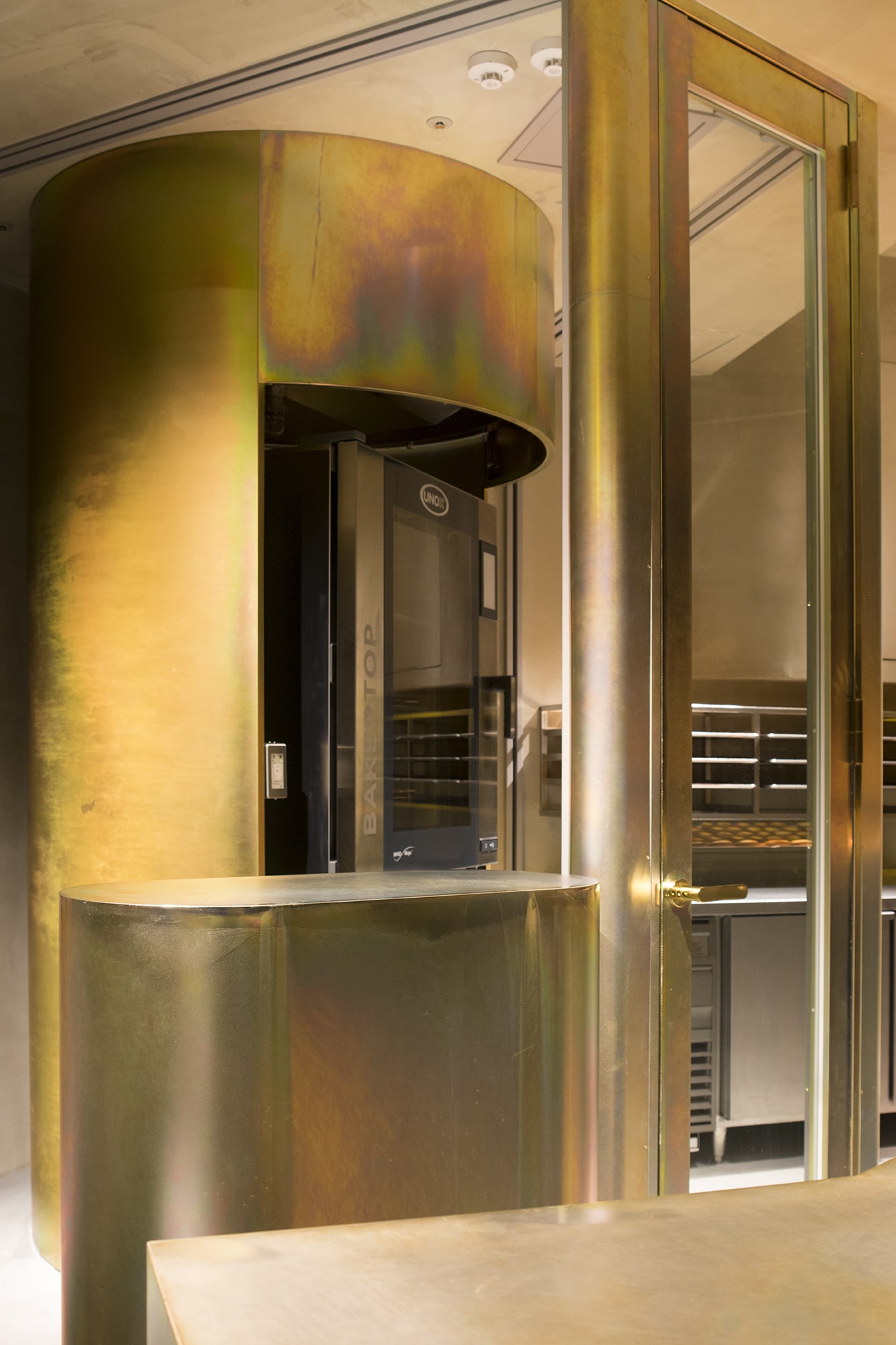
それぞれの什器は製造工程に基づき明確に機能を施された。収納・焼成・熱冷ましを兼ねた陳列台・接客・防火扉など幾度も詳細検討されメッキされた柱体に納められている。それは製造過程の全てを見せるため細心の注意が払われた。機能的であれば美しい所作をも見てもらえると思ったからだ。
百貨店と工房、市場と静寂な寺院、チーズタルトと工業製品。そのような相反する風景を作りながらも、商品や地域特有の素材を用いることで、違和感が良き気付きとなることを目指した。この店のメッキされた風景も土地や人の記憶にあるものと思う。
アイデアソースの一つである仏像。その前では誰もが静寂の中、研ぎ澄まされた心になり、自分と向き合う。そこに美があると思っている。他との差異でものを選ぶのではなく、自分の心の中から美を選択して、商品と向き合って欲しい。
メッキ工場と寺が共存する町。どちらもこの町の人々の記憶にアプローチするものだ。そこでメッキとタルトという相反する二つが新しい調和を生む。町や人の記憶や物語に関与するデザインは革新的だと思う。そしてこの「良き違和感」や「なぜ私は気になるのか?」を読み解くことが、デザインの楽しさでもあると思う。それをきっかけに、商品はもちろん・地域や環境への関心に繋がっていく。それが有益なデザインであると考えている。
BAKE CHEESE TART specializes in freshly baked cheese tarts with an integrated workshop as a theme. An integrated workshop not only allows the shop to offer freshly baked cheese tarts to the customers, but also allows them to feel the ambiance of baking and enjoy the design of the shop. This shop is located in the food department of a department store with a lively atmosphere like a morning market. We felt that rather than shouting in the hustle-bustle to gain attention of the customers, the shop would actually stand out if the shop remained in tranquility like a temple, attracting attention to the products. A glass wall was installed to divide the shop from the surrounding environment, and a symbolic ringed hole was provided in only the area where customers are served.
The kitchen is completely visible through the glass, where galvanized fixtures made with industrial materials are installed. We felt that the galvanized yellow, gold and rainbow burnish resemble the heat, colors and scent of freshly baked cheese tarts, and may create an interesting contrast of the “sizzling” sensation between the sweet and soft cheese tart and hard and industrial galvanized surfaces.
Each fixture was given a clear function based on production process. Detailed studies were done repeatedly for items and processes such as storage, baking, display and cooling rack, customer service and fire door which are all built into the galvanized main pillar. This was carried out carefully to showcase the entire production process to the customers in hopes that people will notice the beauty in each motion of making in functional space.
This region inherits exceptional galvanization technique by craftsmen who supported the rise of Japan’s postwar economy in the downtown factories. On the other hand, historic temples also remain, enshrining Buddha statues glowing with galvanized surfaces, creating contrasting sceneries in the area. The galvanized shop will call up scenes in the minds of the locals from this area. I must admit my imprudence that the source of inspiration for this project was the fact that a galvanized Buddha statue looked “delicious” in my eyes.
By creating contrasting sceneries between a department store and a workshop, a lively market and a quiet temple, and cheese tarts and industrial products, we aimed to derive a pleasant mismatch utilizing products and materials unique to the region in hopes that this will trigger interest in not only the product but also the region and environment.
In any commercial environment, there seems to be an overemphasis on how to make the products stand out; the use of more vibrant colors than competitors, larger signage and raising one’s voice to gain attention. Because scenic regulations are not strictly enforced in Japan, both the city and country are filled with signs. While it is a landmark in some locations, many are unbearable for the eyes and ears. In many cases, interior design is not an exception to take part in the signage war. However, this shop aimed for the opposite. The goal was to have those who dread the visual noise to notice this shop and think, “There’s something different about this place”.
Each fixture was given a clear function based on production process. Detailed studies were done repeatedly for items and processes such as storage, baking, display and cooling rack, customer service and fire door which are all built into the galvanized main pillar. This was carried out carefully to showcase the entire production process to the customers in hopes that people will notice the beauty in each motion of making in functional space.
Standing in front of a Buddha statue which was a source of idea for this project, one finds a sense of peace in serenity, sharpening our ability of self-reflection. There is a certain beauty in the act. The concept was to encourage customers to select products based on their sense of beauty coming from within their heart rather than by comparison among the shops in a clamorous department store.
In this town where metal galvanization factories and temples coexist, the two very different products; galvanized metal and tart, brought about a new harmony. Both products leave an impression in the minds of people from this town. Design implicating memories and stories of the town and people is quite innovative. There is also pleasure of appreciating design when one attempts to understand this “pleasant mismatch” and the reason of one’s curiosity.
Selecting something from one’s own sense of beauty rather than by comparison with others lead to interest in not only the products themselves, but also in appreciating design and the region in which the products come from. We believe this is what we call a good design.
プロジェクト : ベイクチーズタルト あべのハルカス店
竣工 : 2016年9月
場所 : 大阪府大阪市
規模 : 24.67平米
クライアント : BAKE
ディレクション : BAKE 貞清誠司 菊池慎平
インテリアデザイン : やぐゆぐ 鈴木文貴
照明 : モデュレックス 藤井菜摘
施工 : エイムクリエイツ 斉藤大地
厨房機器 : マナインターナショナル 根岸圭一
撮影 : 西岡潔
Project : BAKE CHEESE TART Abeno Harukas Store
Open : September, 2016
Location : Osaka city, Osaka, Japan
Floor space : 24.67 sqm
Client : BAKE Inc.
Direction : Seiji Sadakiyo (BAKE Inc.), Sinpei Kikuchi (BAKE Inc.)
Interior design : Fumitaka Suzuki / Yagyug
Lighting design : Natsumi Fujii (ModuleX Inc.)
Construction : Daichi Saito (Aim Create co., ltd.)
Kitchen equipment : Mana international.inc
photo : Kiyoshi Nishioka
Photo copy right : BAKE Inc.
